
Digital Accessibility Guidelines for Content Creators
Before you get started, we highly recommend take the TrojanLearn course on Digital Accessibility.
USC’s preferred digital accessibility standard is WCAG 2.1 AA. USC is committed to digital accessibility and continues to focus on the following measures to create an inclusive culture.
Your role as content creator/manager for the Viterbi WordPress websites is ensuring accessibility so we work towards the equitable inclusion of all members of the USC community. It not only benefits those with vulnerabilities, but impacts all of society. This is known as the curb-cut effect. Further, by adhering to ADA guidelines, you lessen the legal exposure of the university and the school.
Here are steps and key practices to implement for a more inclusive online experience.
Summary
- Ensure H-Tags Hierarchy is Appropriately Used
- Avoid Text on Imagery
- Ensure Images Have Alt-Text
- Appropriately Naming Files for Upload
- Ensure Buttons and Icons have Aria-labels
- Ensure frame, iframe, and embed have title attributes
- Ensure Each Element Has Appropriate Spacing
- Avoid Using Hover Materials for Information
- Appropriate Color Contrast
- Appropriately Written Links
- Accessible Video
- Accessible PDFs
Ensure H-Tags Hierarchy Is Appropriately Used
Proper heading structure not only improves the organization and clarity of content for sighted users but also aids screen readers in understanding the hierarchy and flow of information. In short, there are two rules with utilizing h-tags.
- We must ensure there is always an
<h1>tag present in each page and that it matches the page title. There can only be one<h1>tag per page. - H-tags must be used in hierarchical order. By utilizing h-tags (
<h1>,<h2>,<h3>, etc.) appropriately, we enable users to navigate through content more efficiently which enhances the overall accessibility and usability of the website.
We also have documentation on hierarchical structure when utilizing h-tags.
Avoid text on imagery
Adding text to images can unintentionally introduce accessibility barriers for those with disabilities. It is pertinent to keep your design as universally accessible as possible. There are ways around putting text and imagery together through Cornerstone. Please consider that text on an uneven background might be difficult to process, so laying text and image separately will increase readability for everyone and screen readers are able to process said information.
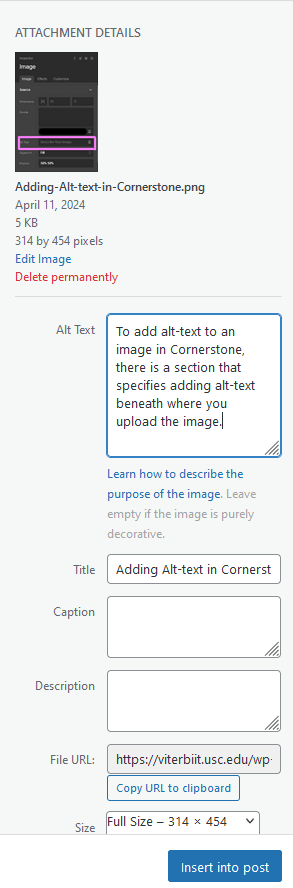
Ensure Images Have Alt-Text
Images play a crucial role in web content, but they can also pose barriers to accessibility for users with visual impairments. By providing descriptive alt-text for images, we empower screen readers to convey the content and context of images to those who rely on auditory cues. Alt-text enables everyone to access and understand the information presented visually. Therefore, when you upload an image, please fill out the appropriate alt-text information within the media library.
Appropriately Naming Files for Upload
Ensure Buttons and Icons Have Aria-labels and Roles
Buttons and icons serve as interactive elements guiding users through a website's functionalities. However, for users navigating through assistive technologies like screen readers, these elements may lack context without proper labeling. Aria-labels and roles provide descriptive labels for interactive elements, ensuring that all users can navigate and interact with your web pages seamlessly.
Learn more in our article on how to apply aria-labels to icons and buttons. You will also learn when it is appropriate to use aria-labels as icons that are deemed decorative do not need aria-labels and roles.
Ensure frame, iframe, and embed have title attributes
Please add the title="" attribute within your iframe and embed codes to ensure screenreaders can identify its content. For example, when pasting the embed code from YouTube, you can simply put the video title within the quotations of title="".

Ensure Each Element Has Appropriate Spacing
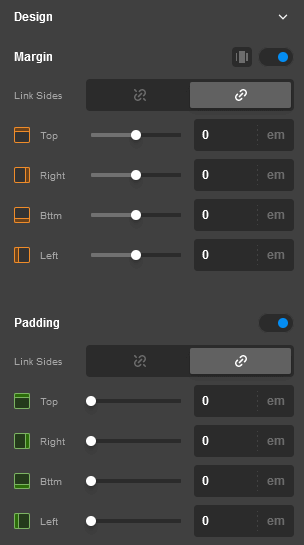
Spacing plays a critical role in enhancing readability and usability for all users, especially those with motor impairments or visual processing difficulties. By ensuring adequate spacing between elements, we facilitate easier navigation and interaction, reducing the risk of accidental clicks or misinterpretation of content.
In Cornerstone, you can adjust the margin and padding of each element. The link icon allows you to adjust all sides at once while the broken link icon allows you to adjust each side individually.
Avoid Using Hover Materials for Information
Appropriate Color Contrast
Color plays a significant role in web design, but it can also hinder accessibility if not used correctly. Ensure that there is sufficient contrast between text and background colors to make content readable for users with visual impairments. Adhering to WCAG standards for color contrast ratios improves legibility and ensures that information is accessible to all users.
Please use this Contrast Checker to test your color contrast score between text and background.
Below are WCAG 2.1 AA requirements.
The visual presentation of text and images of text has a contrast ratio of at least 4.5:1, except for the following:
- Large Text
- Large-scale text and images of large-scale text have a contrast ratio of at least 3:1;
- Incidental
- Text or images of text that are part of an inactive user interface component, that are pure decoration, that are not visible to anyone, or that are part of a picture that contains significant other visual content, have no contrast requirement.
- Logotypes
- Text that is part of a logo or brand name has no contrast requirement.
Appropriately Written Links
Links are essential for navigating between pages and accessing additional resources, but poorly written or ambiguous link text can confuse users, especially those using screen readers. Instead of using vague phrases like "click here" or messy URLs, incorporate descriptive link text that provides context and indicates the destination or purpose of the link. For example, instead of "Click here for more information," use "Learn more about our accessibility initiatives."
Note that link text should always be unique unless the link is same URL as another, in which case the link text can be the same for each instance.
Accessible Video
To ensure accessibility and performance, most video content should be hosted off-site using third-party platforms such as YouTube or similar services, and then embedded on the page. These platforms provide built-in support for accessibility features, including captions and playback controls. If video is self-hosted directly on the site, it must meet applicable accessibility standards, including but not limited to accurate captions, audio descriptions when necessary, keyboard operability, and compatibility with assistive technologies.
Accessible PDFs
At the Viterbi School of Engineering, we're committed to ensuring that all our digital resources are accessible to everyone, including individuals with disabilities. This commitment extends to the PDFs we create and share, making sure they meet the same high standards of accessibility that we uphold across all digital content.
Creating accessible PDFs involves following specific guidelines and using tools that make documents readable and navigable for individuals using assistive technologies. Our approach is informed by USC Central’s comprehensive guidelines on Creating Accessible Content, which provide foundational standards for accessibility across the university. Additionally, the USC PDF Accessibility Checklist offers a practical, step-by-step framework for ensuring our PDFs comply with accessibility best practices.
Please read on our in-depth guide on PDF accessibility.